


Overview
My Role
Lead Product Designer – UX Strategy, Research, and UI Design
The Challenge
Improve engagement and retention of our credit and financial platform
The Outcome
Achieved a 98.4 SUS (System Usability Scale) score and a 46% increase in engagement.
Before

The Problem
-
Too much text – Felt like a blog, not a financial tool.
-
Hard to find key features – Important tools were buried.
-
Not mobile-friendly – Poor experience on small screens.
-
Outdated & uncompetitive – Lagged behind industry leaders.
-
Low engagement – Users weren’t interacting with insights.
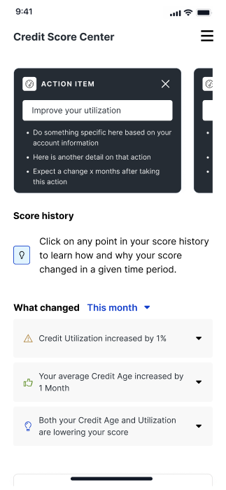
How I tackled it
I conducted usability testing to evaluate how users navigated credit insights and identified pain points. I analyzed engagement data to pinpoint where users dropped off and where they engaged most.
I simplified complex credit data into digestible, user-friendly insights to enhance clarity. I introduced progressive disclosure techniques to reduce cognitive overload and guide users step by step. I designed a modular, scalable system that could adapt to future financial tools and expand functionality.
I developed interactive prototypes and iterated on them based on multiple rounds of user feedback. I created a clean, structured dashboard that prioritized key insights and guided users toward action. I ensured accessibility and mobile responsiveness to provide a seamless experience across all devices.
I conducted multiple rounds of user testing to validate usability, comprehension, and overall effectiveness. I optimized the visual hierarchy and interactions to improve user engagement based on testing insights. The final refinements led to significantly higher engagement and an industry-leading 98.4 SUS score.
Research & Ideation
James
I checked my score once, but there’s no reason to come back. Nothing changes, and I don’t know what else I’m supposed to do here.
Sam
I didn’t even realize there were tools to help me improve my credit. They’re buried—I had to click around a lot to find anything useful.
Drew
I mostly check my credit on my phone, but the site isn’t easy to use. I have to scroll for days to read everything.
Lisa
Credit Karma makes it easier to understand what’s affecting my credit. This one just throws a bunch of information at me.
Competitive analysis


Early ideation
Strategy & Execution
Design mobile first
Most users check their credit on mobile, but the previous experience was not optimized for small screens. We redesigned the platform with a mobile-first approach, ensuring seamless usability across all devices.

Build flexible systems for whitelabel use
The platform needed to be easily customizable for Experian’s B2B partners, allowing financial institutions to repurpose it under their own branding. We designed a flexible, modular system with customizable UI components, brand themes, and adaptable content structures.

Dynamic content for personalization
To create a more tailored experience, I designed a system that dynamically adjusts credit insights, recommendations, and UI content based on each user’s financial profile.


User Testing
Users found the product extremely user friendly, informative and helpful. Users preferred the product to their current credit monitoring tool.


